Many people struggle with decision-making, especially when faced with multiple options and conflicting opinions. Current solutions like group chats and polls lack structure and make it difficult to track feedback, weigh different perspectives, and arrive at confident decisions.
View Prototype6 participants were surveyed with simple questions. They were asked about their decision making journey if they had two movies they wanted to watch equally.
of people wish they had an easier way to gather opinions when making decisions.
often decide to either give up or make a completely different choice.
felt confident in their decisions when they didn't take input from others.
User research revealed that Help Me Decide resonates most powerfully with a specific, underserved audience: people who struggle with decision fatigue, individuals living with ADD/ADHD, and those navigating unfamiliar choices/experiences. Rather than a general-purpose tool, the app fills a genuine gap offering structure and clarity to users who need it most. This focused insight sharpened the product's direction and affirmed a core design principle: the best tools don't try to serve everyone. They serve someone exceptionally well.
"I trust my friends' opinions, but I need a better way to organize all their feedback when I'm trying to make a decision."
| Stage | Action | Touchpoint | Thoughts | Opportunities |
|---|---|---|---|---|
| Awareness | User hears about app from friend | Word of mouth, App Store | "This could help with my weekend plans decision" | Clear value proposition in app description |
| Onboarding | Downloads app and creates account | Sign-up flow | "Hope this is easy to use" | Simple, quick onboarding process |
| First Poll | Creates first decision poll | Poll creation screen | "Let me try this for picking a restaurant" | Templates and examples to guide users |
| Sharing | Invites friends to vote | Share feature | "I wonder if my friends will actually use this" | Easy sharing options, notifications |
| Voting | Friends submit their votes | Voting interface | "I want to see what others think" | Real-time updates, engaging voting UI |
| Results | Reviews results and makes decision | Results dashboard | "This makes it so clear which option is best" | Clear visualizations, export options |
| Retention | Returns for future decisions | App home screen | "I should use this for my vacation planning too" | History of past decisions, suggestions |
From rough ideas to polished designs, exploring different approaches to key screens
Initial Sketch 1
Initial Sketch 2
Initial Sketch 3
Conducted moderated usability tests with 8 participants to evaluate the poll creation and voting flows. Participants were asked to complete key tasks while thinking aloud.
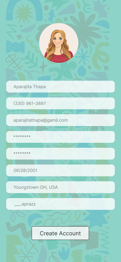
Initial Sign Up Screen
Issue: Users were having trouble filling all the fields all on same screen.
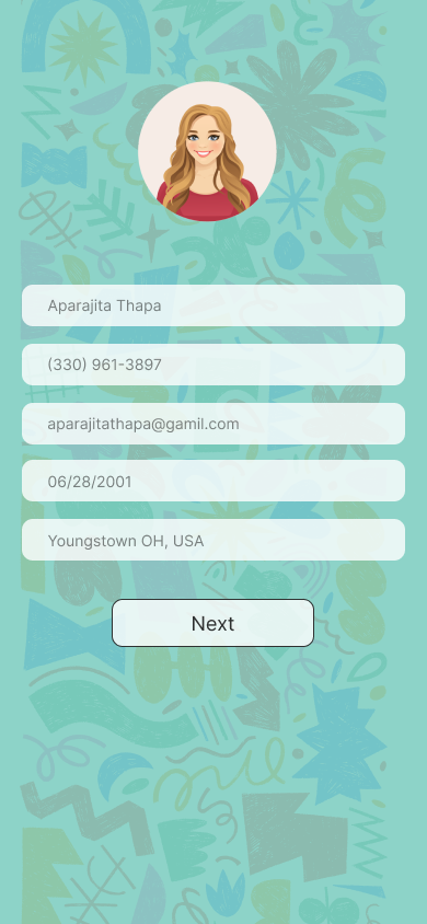
Solution: Broke them down into two separate screens for better organization and smoother experience.
Sign Up Screen I
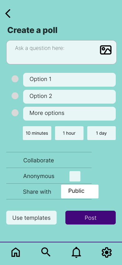
Initial poll creating screen
Issue: Users mentioned wanting customizable timer options for their polls.
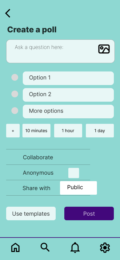
Solution: Added a button for poll creators to set custom timer options.
Final poll creating screen with added button for customized timer
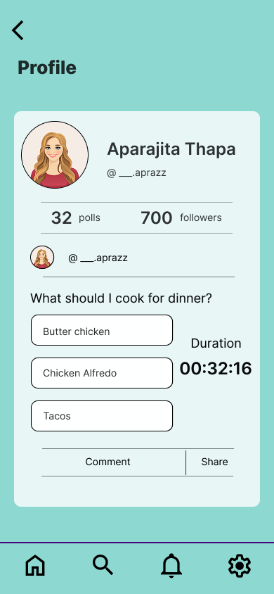
Profile
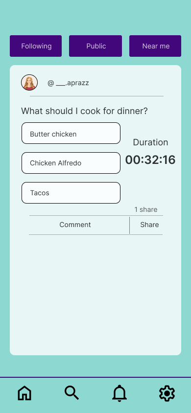
Shared Post
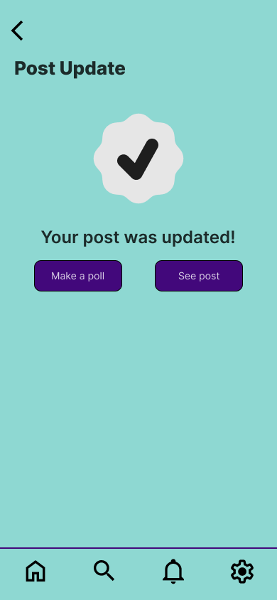
Post Update
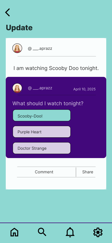
Updated Post
Post, Comment and Reply
Settings
This project taught me the importance of balancing feature complexity with user experience simplicity. The biggest challenge was creating a weighted voting system that felt intuitive rather than overwhelming. Through multiple rounds of testing and iteration, I learned that progressive disclosure - revealing advanced features gradually - was key to maintaining simplicity while offering depth.
The ultimate goal is to reduce decision fatigue and increase confidence in choices by providing structure and community input. Early user feedback suggests that the app successfully addresses the core problem of scattered, disorganized feedback that makes decision-making harder than it needs to be.